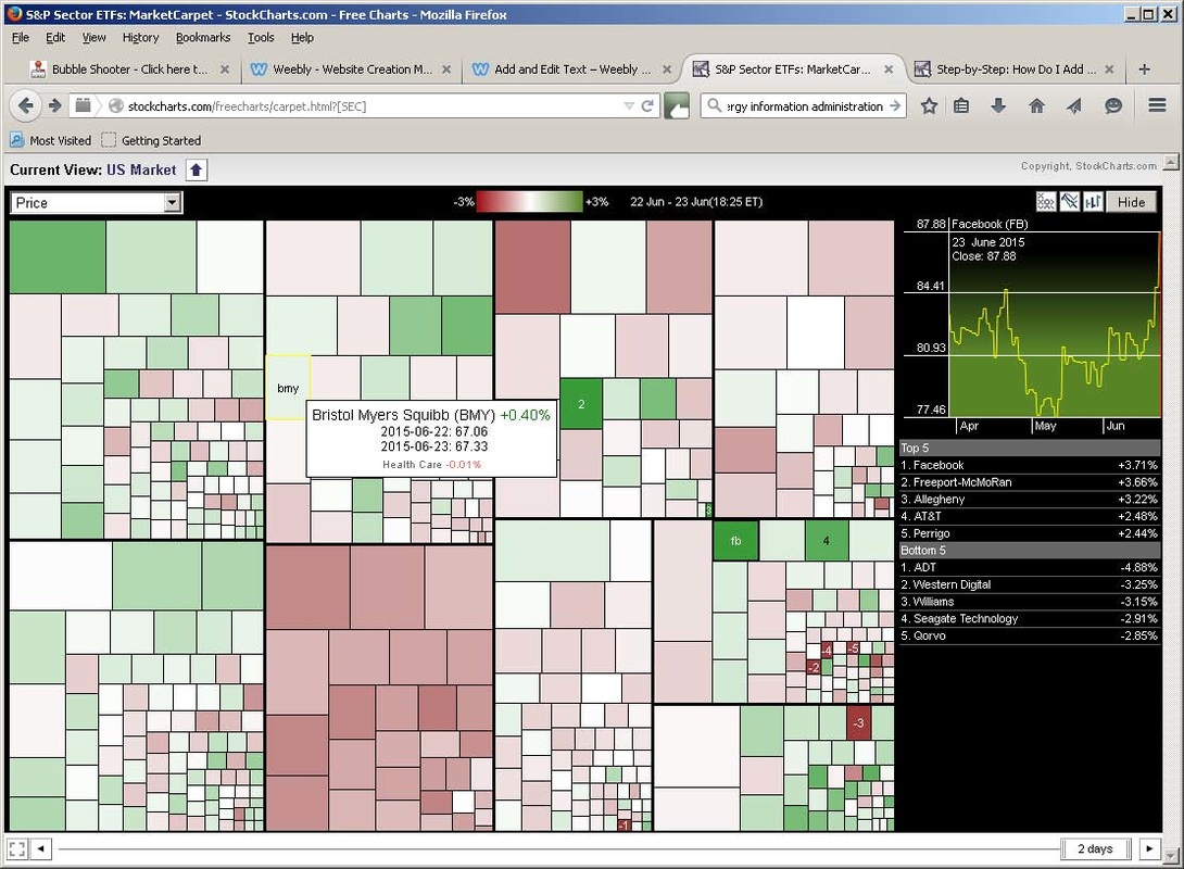
This is either a terrific avant-garde graphic to enlarge and hang on your wall, or a market "carpet" - a depiction of one day's activity in the stock market. This particular graphic shows sector activity for one day. Green areas are sectors that gained and red is ... for the opposite. Within a sector the squares indicate individual companies, and in a live graph, hovering over one of these squares shows what company it is, their share price, and the gain or loss for the day. It's a quick way to see - assuming you have any interest - what the market did for that day, or any time frame you choose.
Chart courtesy of StockCharts.com http://stockcharts.com/
© 1999-2012 StockCharts.com. All Rights Reserved.
Chart courtesy of StockCharts.com http://stockcharts.com/
© 1999-2012 StockCharts.com. All Rights Reserved.
 RSS Feed
